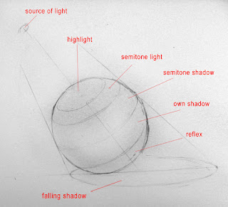
 pencils HB, 2b, eraser, paper. But before we start, we must understand the form, which is a sphere. It is important to understand how the light influences on what we see. Everything depends on a source of light, as you see in the image below, the sphere can be schematically divided into zones of lights and shadows.
1)Highlights are the most spotlit places on the object and are perpendicular to the source of light.
2)Semitones are intermediate zones between the own shadow of the object and the highlight.
3)Own shadow is the darkest place on the object.
4)Reflection is a zone, where the surrounding surface is reflected onto the object. It is not that light as a highlight even if an object lies on a white surface, in a black-and-white picture it can be colored as in semi-shadow area and in color images it obtains the color of the surrounding surface, but of course not that intensive:
 This is a rough coloring of the sphere:
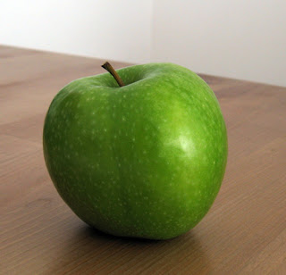
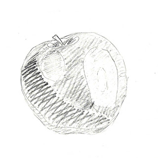
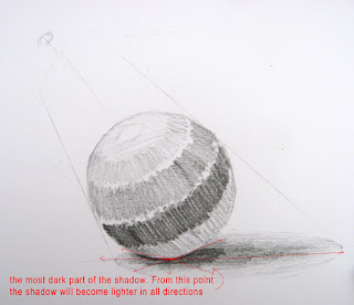 Now we can apply this information to our apple. As you can see, in this case the source of light lies somewhere on the same axis as an apple, and depending on this, all the other zones will be placed correspondingly:
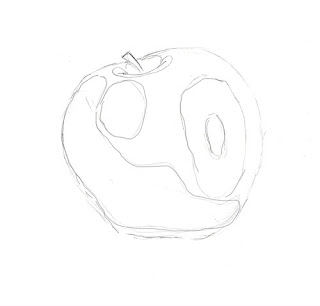
 Let's start with a shape of an apple. You don't have to make it look exactly the same, but of course you can try. First shape you can draw with an HB pencil, which must not be sharp, for it may leave holes in paper and may cause not nice lines when you will want to shade an apple with more soft pencils (scans are not good, actually I didn't expect that they would be that bad) :
  And now all the zones we marked on our green one, we place on our paper apple :
Next step will be roughly shade the zones according to the sphere in the top of the lesson. This you can do with 2B pencil, again not with sharp, but flat tip. If you do so, it will be easier to shade later and it covers larger areas, which is a slight economy of time:
Now half of the job's done :) What we do now, is take again the 2B pencil(again with flat tip) and make such funny curls
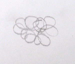 all over the shaded zones. This kind of shading is good for round surfaces but you can use any other kind of shading. I usually start with dark areas, but in this case it is up to you.
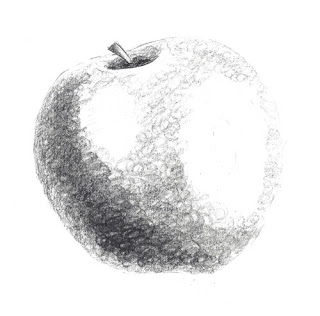
Now, when we have shaded all the apple we get an image like this:
Already nice looking, but what we now can do is take a piece of paper, or cotton bud, or anything like this, and slightly blur the image to get rid of good-seen curls of the shading. Now we have this:
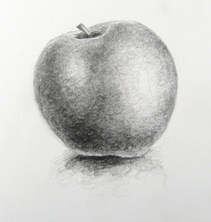
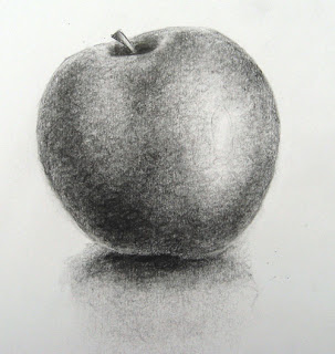 We finished. Result is not perfect, but draw your apple every day for two weeks and you will become the best apple painter in the world!


